Natural Beauty: A Victorian Spine Aesthetic Journal Layout
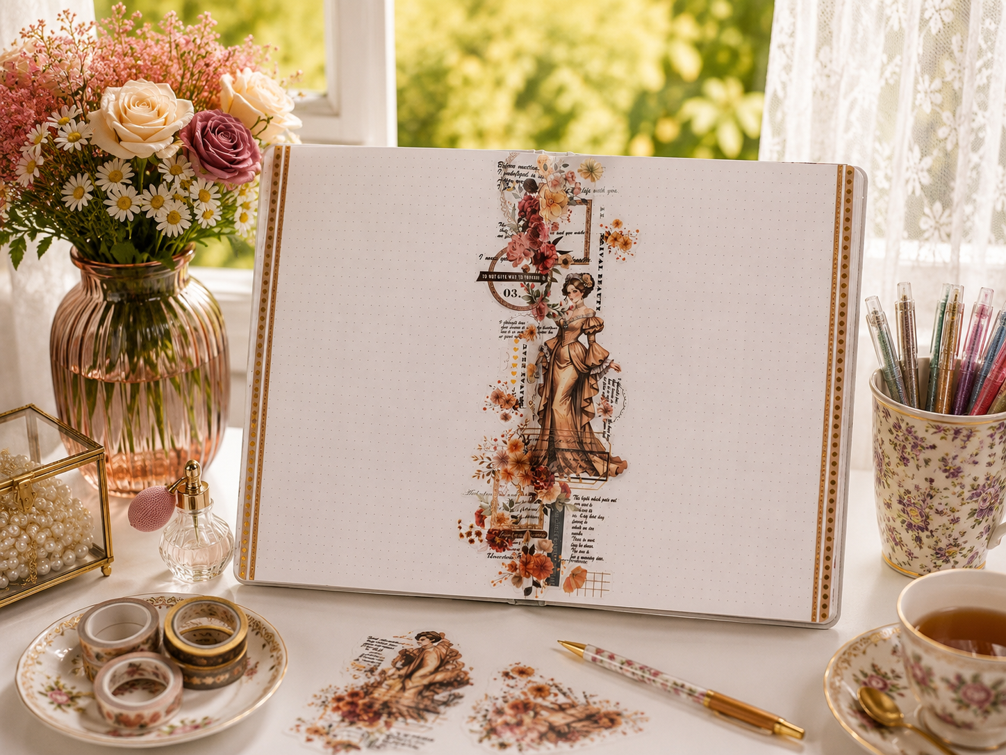
This refined aesthetic journal layout takes a different approach to the spread format entirely, concentrating all its elements into a single vertical column that runs straight down the spine — leaving both pages open on either side as vast, uninterrupted writing space. An Edwardian woman in a caramel-toned ruffled gown stands at the centre, surrounded by terracotta dahlias, rust-red florals, and scattered copper blooms that cascade above and below her like a garland arranged in her honour. Vintage script fragments, a circular stamp reading “Do Not Give Way to Vulgarity,” and the phrase “Natural Beauty” running vertically in bold type give the column a composed, slightly imperious editorial quality.
The colour story is as restrained as the composition: warm ochre, burnt clay, and parchment throughout, with gold dot borders framing both outer edges of the spread and a washi tape stripe of textured gold down the right margin echoing the central column’s warmth. The result is a journal page layout that treats white space not as emptiness but as the whole point — a deliberate frame around the decorative spine that makes both sides feel like premium writing real estate. This is a spread for someone who has things to say and wants the page to stay out of their way while they say them.