Writing Letter: An Autumn Editorial Aesthetic Journal Layout
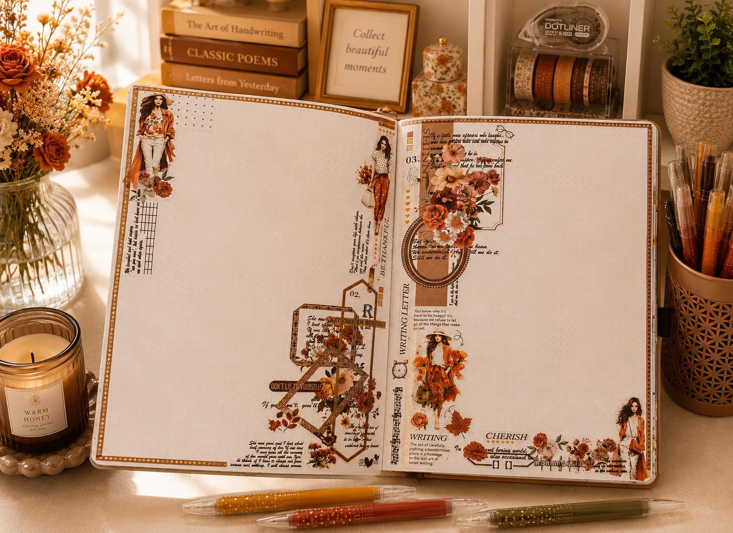
This richly layered aesthetic journal layout has the warmth and weight of a well-worn autumn coat, assembling its elements in two vertical strips that run along the inner and outer edges of the spread whilst leaving the centre of both pages deliberately open. The palette is deeply seasona, burnt sienna, terracotta, amber, and cream, carried through clusters of rust dahlias, copper marigolds, and fallen maple leaves that anchor each strip at top and bottom. Three fashion-forward character stickers in coordinated autumn tones are placed at intervals down the composition, giving the spread the quiet narrative of a woman moving through her day with somewhere to be.
The typographic layering is the spread’s real achievement: “Be Thankful,” “Writing Letter,” “Don’t Lie to Yourself,” “Cherish,” and a longer passage defining writing as “a homage to the lost art of letter writing” accumulate across the spine in a mix of scripts, stamps, and serif type that reads like a commonplace book in progress. Geometric gold frames and a fine diamond-dot border hold the arrangement together without over-tightening it. The result is a journal page layout that feels like it was made by someone who has both an opinion on fountain pens and a stack of Classic Poems on their desk — which, given the styling, is entirely possible.